Soap Opera magazine front cover
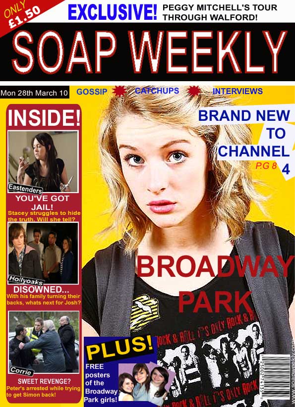
For our magazine cover we used the character of Summer on the front cover; from our trailer it is obvious that she is one of the main characters from our soap opera as she constantly pops up. I think that the soap opera magazine combined with our main product is extremely effective as both products use the character of summer therefore our audience will recognise that both products are about the same soap opera. We have made our front cover exciting and interesting to look at by using bright bold colours. We have also incorporated many scandalous storylines which I think is effective as they will make our audience members wonder what storylines our soap will cover. By using images of existing soap operas I think we have made our magazine front cover very realistic looking. We have also advertised on our front cover that our soap is “Brand New” so that we will be able to interest new audience members.
Website
We made sure that our websites were clear and easy to read as we had to include a lot of information. Kanchan used the colour themes of black and red on her website to create a sense of consistency whilst Amanda used the colours pink and black. We both ensured that our websites were easy to navigate around by creating many different pages for each of the different sections. All our texts and fonts are in the same colours and sizes so that there is no confusion and it is easy and clear to read. We included links to our evaluation website, our trailer, our official website, our outtakes website and our Facebook pages.